B2B Email System Optimisation
B2B Email System Optimisation
Improving Deliverability and Accessibility through Design Engineering
Improving Deliverability and Accessibility through Design Engineering
DURATION
January 2025 - March 2026
ROLE
Designer / Design Engineer
TOOL
Figma, Visual Studio Code
Overview
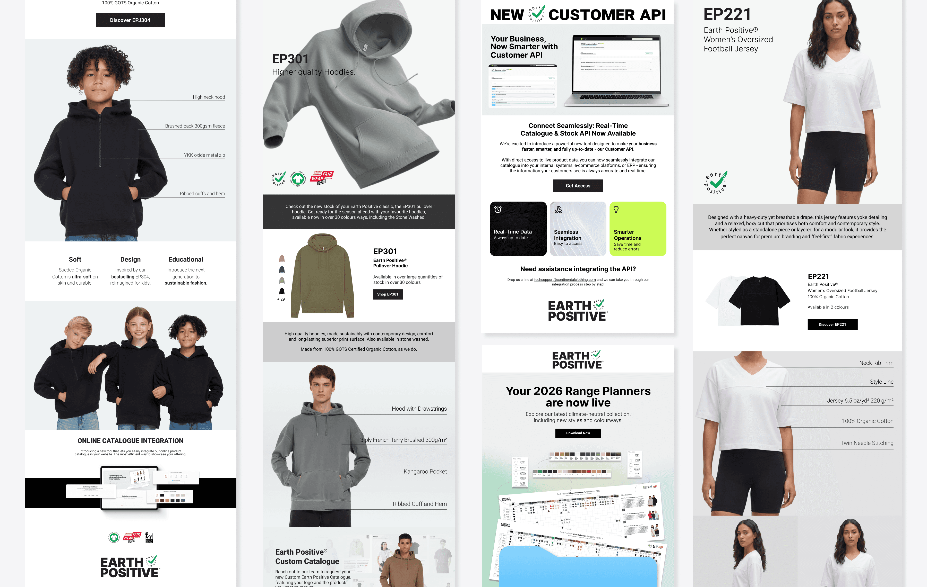
When I joined the EarthPositive team at Continental Clothing Co., every B2B email was a single exported JPG. Because major clients like Outlook block images by default, many recipients opened our emails to a blank screen. I proposed and led a full rebuild: replacing image-only emails with hand-coded HTML/CSS templates that stay readable, accessible, and on-brand in every client.
When I joined the EarthPositive team at Continental Clothing Co., every B2B email was a single exported JPG. Because major clients like Outlook block images by default, many recipients opened our emails to a blank screen. I proposed and led a full rebuild: replacing image-only emails with hand-coded HTML/CSS templates that stay readable, accessible, and on-brand in every client.
Impact
2X
2X
Click-through rate
0.7% → 1.4%
2.7×
2.7×
Click-to-open rate
1.3% → 3.6%
12,015
12,015
Recipients reached
Nearly 2× list growth
100%
100%
B2B campaigns on system
Adopted as team standard
Adopted as team standard
Probelm
Low Visibility
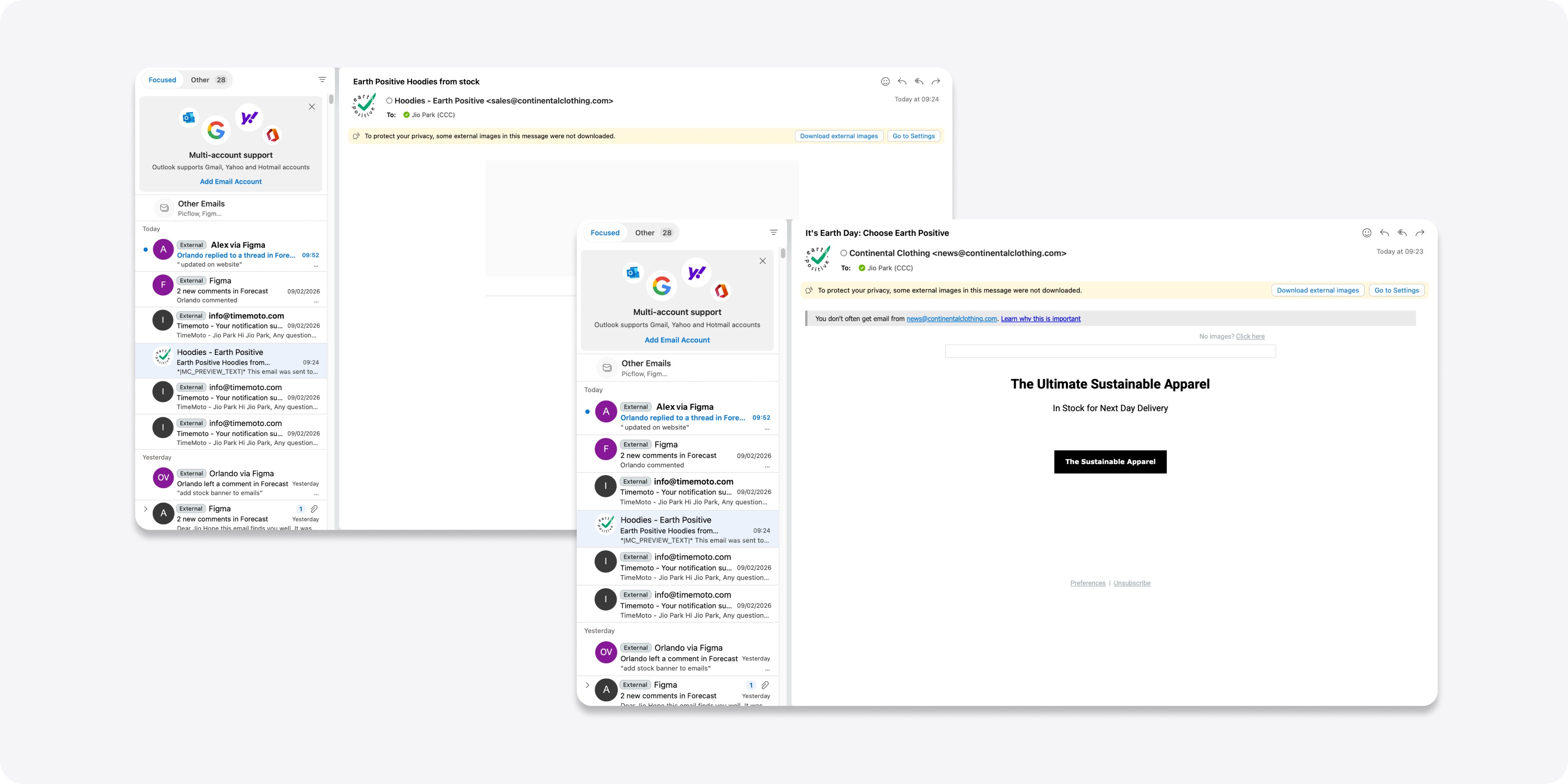
With images blocked in Outlook, recipients saw nothing. No message, no CTA, no reason to scroll.
With images blocked in Outlook, recipients saw nothing. No message, no CTA, no reason to scroll.
Inconsistent rendering
A single JPG can't adapt. Text became illegible on mobile, and file size slowed loading on poor connections.
A single JPG can't adapt. Text became illegible on mobile, and file size slowed loading on poor connections.
Inaccessible by design
The old JPGs had no alt text, so a blocked image conveyed nothing and screen readers had nothing to read.
The old JPGs had no alt text, so a blocked image conveyed nothing and screen readers had nothing to read.
No measurable signal
Because the entire email was one image, we couldn't tell which content drove clicks. Every click was the same click.
Because the entire email was one image, we couldn't tell which content drove clicks. Every click was the same click.

Process
Step 1. Audit
I tested our existing emails across the three clients that carry most of our B2B audience (Outlook, Gmail, and Apple Mail) and documented every failure, from blocked images to broken layouts to missing alt text. This audit became the internal case for rebuilding.
I tested our existing emails across the three clients that carry most of our B2B audience (Outlook, Gmail, and Apple Mail) and documented every failure, from blocked images to broken layouts to missing alt text. This audit became the internal case for rebuilding.
Step 2. Design for the worst case
In Figma, I designed templates assuming images would not load. Hierarchy, message, and CTA had to work as live text first, so imagery became enhancement rather than foundation.
In Figma, I designed templates assuming images would not load. Hierarchy, message, and CTA had to work as live text first, so imagery became enhancement rather than foundation.
Step 3. Build
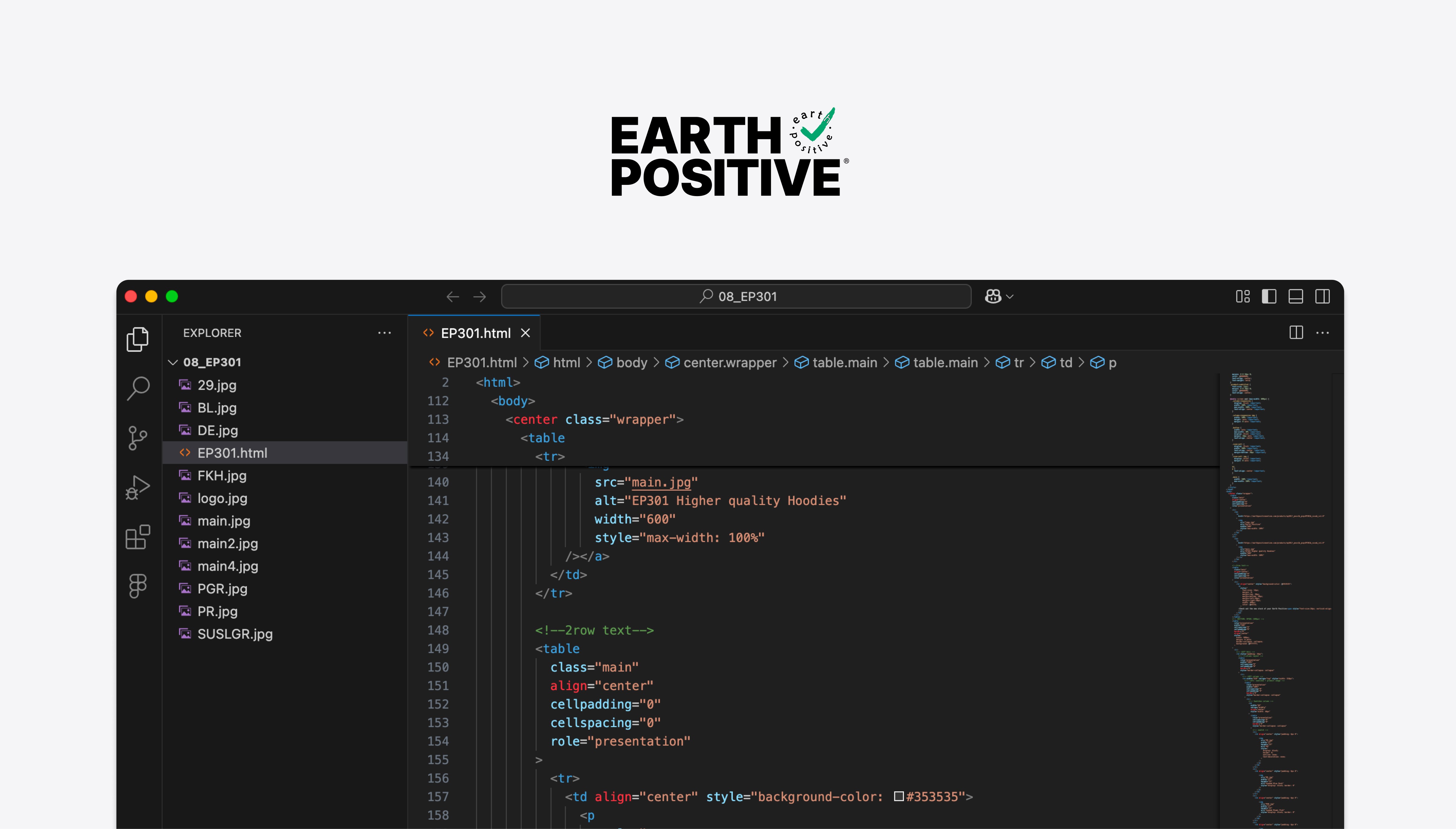
I hand-coded the templates in HTML/CSS with table-based layouts and inline styles, the only approach that renders reliably across fragmented email clients.
I hand-coded the templates in HTML/CSS with table-based layouts and inline styles, the only approach that renders reliably across fragmented email clients.
Step 4. Test and iterate
Before launch, I imported each HTML build into Campaign Monitor and sent test emails to my own Gmail, Outlook, and Apple Mail accounts, checking every one on both desktop and mobile. I kept a rendering checklist and fixed client-specific quirks such as Outlook's DPI scaling and Gmail's style stripping until every combination passed.
Before launch, I imported each HTML build into Campaign Monitor and sent test emails to my own Gmail, Outlook, and Apple Mail accounts, checking every one on both desktop and mobile. I kept a rendering checklist and fixed client-specific quirks such as Outlook's DPI scaling and Gmail's style stripping until every combination passed.
Solution
Structural HTML
Structural HTML
Visual assets stay separate from content. Headlines and body live as real HTML text, so the layout and message survive any client and any setting.
Visual assets stay separate from content. Headlines and body live as real HTML text, so the layout and message survive any client and any setting.
Text-First Strategy
Text-First Strategy
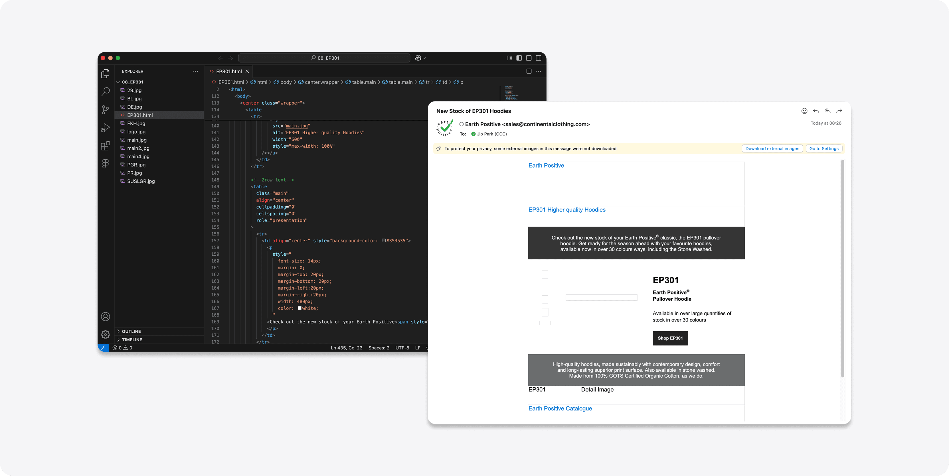
Even with images fully blocked, the core message and CTA button are immediately visible and clickable.
Even with images fully blocked, the core message and CTA button are immediately visible and clickable.
Cross-Client Optimisation
Cross-Client Optimisation
Cross-Client Optimisation
Inline CSS and table-based layout deliver a consistent experience across Gmail, Outlook, Apple Mail, and mobile clients.
Inline CSS and table-based layout deliver a consistent experience across Gmail, Outlook, Apple Mail, and mobile clients.
Descriptive alt text
Descriptive alt text
I wrote alt text for every image, so even when a client blocks it, the recipient still knows what the visual was about, and screen readers can announce it. This closed the accessibility gap the old JPGs left wide open.
I wrote alt text for every image, so even when a client blocks it, the recipient still knows what the visual was about, and screen readers can announce it. This closed the accessibility gap the old JPGs left wide open.
Reusable system
Reusable system
I structured the code as a modular template set, covering header, content blocks, CTA, and footer, so the marketing team can assemble new campaigns without touching code.
I structured the code as a modular template set, covering header, content blocks, CTA, and footer, so the marketing team can assemble new campaigns without touching code.

Key results
Every image-based campaign plateaued at the same 0.7% click-through rate, a consistent ceiling rather than a coincidence. After the HTML rebuild, engagement doubled even as the recipient list grew to nearly twice its size, isolating the structural redesign as the driver. Every template was verified across all three major clients (Outlook, Gmail, and Apple Mail) before launch, with no blank screens and no broken layouts.
Every image-based campaign plateaued at the same 0.7% click-through rate, a consistent ceiling rather than a coincidence. After the HTML rebuild, engagement doubled even as the recipient list grew to nearly twice its size, isolating the structural redesign as the driver. Every template was verified across all three major clients (Outlook, Gmail, and Apple Mail) before launch, with no blank screens and no broken layouts.
What I learned
Email is the most hostile rendering environment in design. Working within its constraints taught me to design for the worst case first, a mindset I now apply to every UI project. Progressive enhancement isn't a technique, it's a philosophy.
Email is the most hostile rendering environment in design. Working within its constraints taught me to design for the worst case first, a mindset I now apply to every UI project. Progressive enhancement isn't a technique, it's a philosophy.